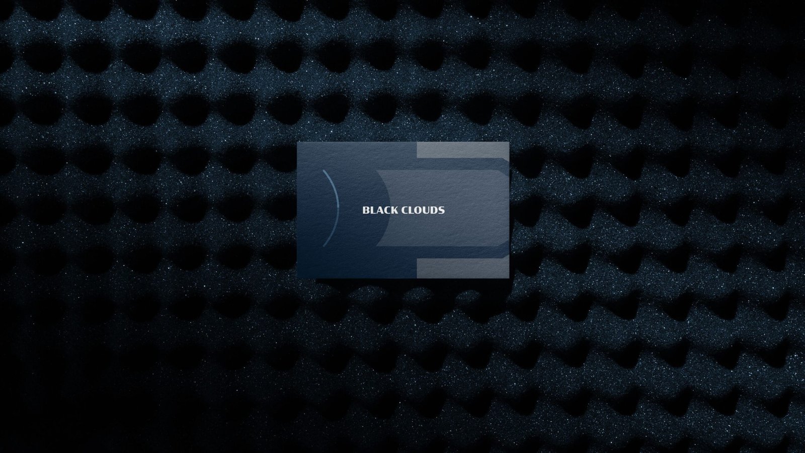
Black Clouds is a Saudi event house specializing in corporate exhibitions, conferences, and immersive brand experiences. The brand transforms ideas into purposeful experiences through creative direction, movement, and spatial storytelling.
The challenge was to build a distinctive identity for Black Clouds that could communicate movement, direction, and creative leadership without relying on the conventional visual language of the events industry.
As an event house specializing in exhibitions, conferences, and immersive experiences, Black Clouds needed an identity capable of extending far beyond a logo one that could operate across large-scale environments, spatial experiences, digital platforms, printed materials, and multiple brand touchpoints.
The identity needed to feel contemporary, confident, and experiential while remaining flexible enough to adapt to different events, environments, and audiences.
Brand Attribute
Direction / Movement / Leadership / Experience / Progress
Goal
The goal was to create a visual identity built around the idea of purposeful movement.
The identity needed to position Black Clouds as more than an event organizer as a brand that provides the creative direction behind meaningful experiences, transforming ideas into environments and experiences that move people forward.
The visual system was designed to establish a clear connection between direction, movement, and experience, creating a flexible identity that could scale from a single printed touchpoint to large-scale spatial environments.
Result
FOURP® Agency developed a comprehensive visual identity for Black Clouds built around a simple principle:
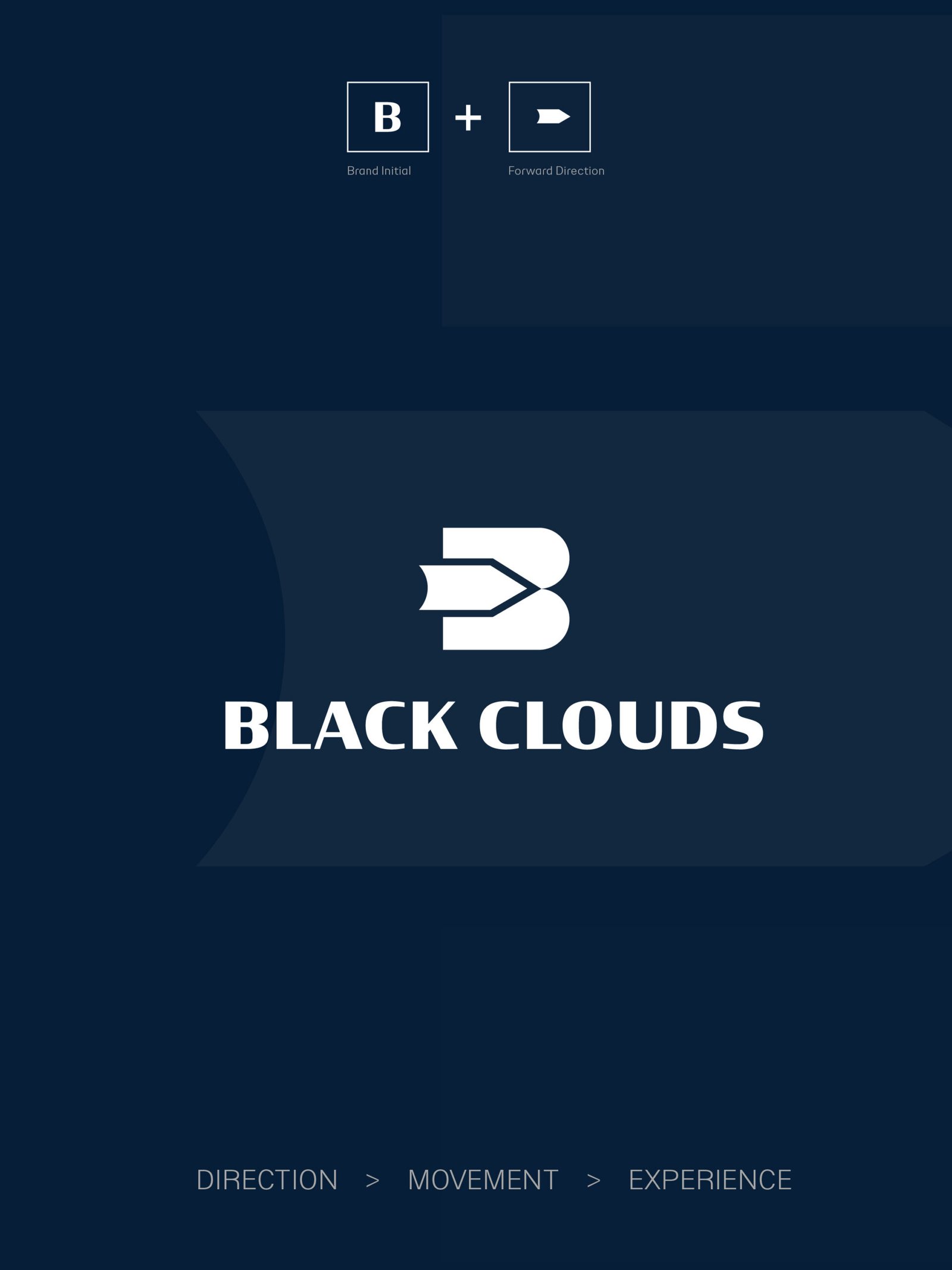
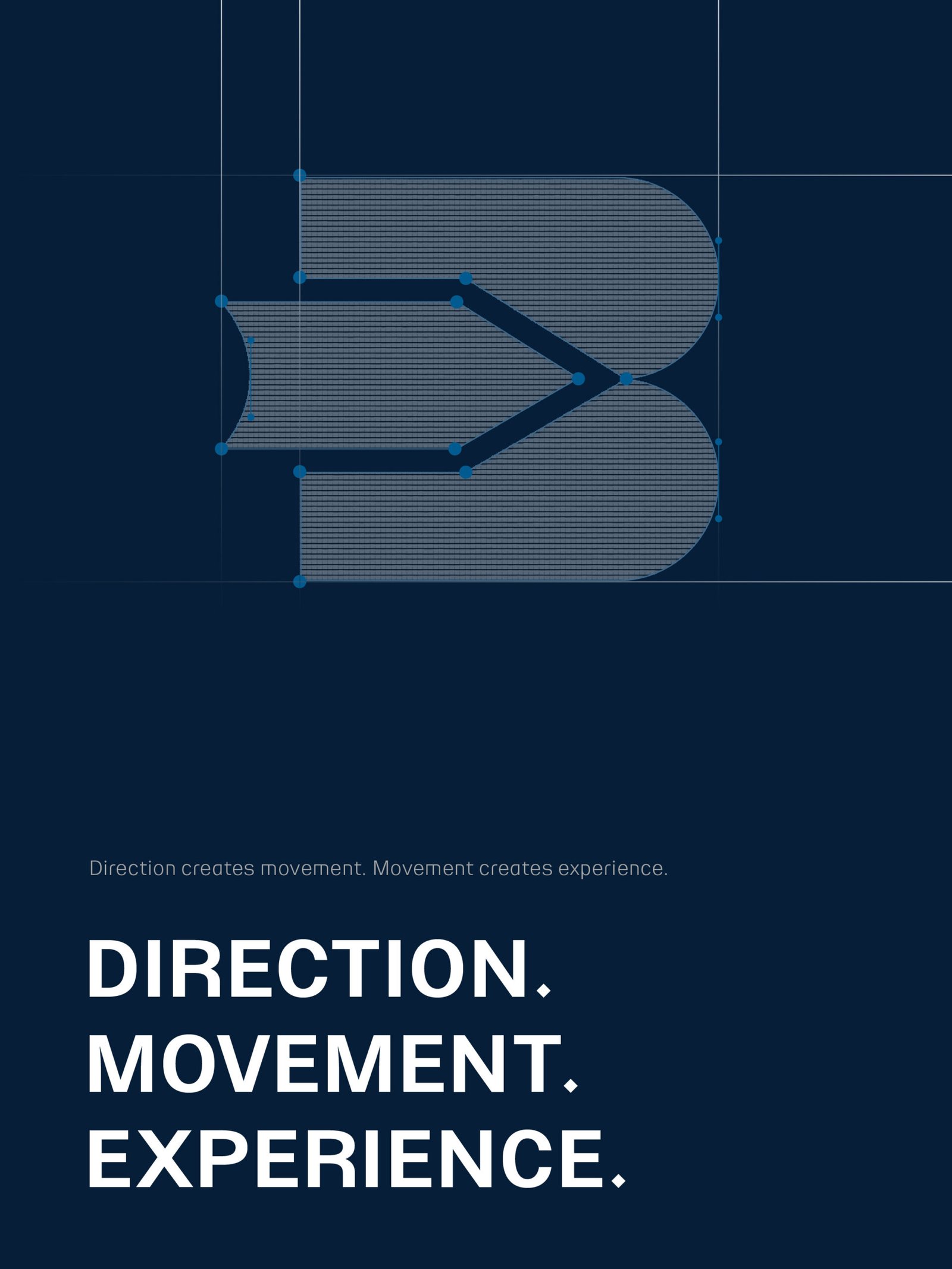
Direction creates movement. Movement creates experience.
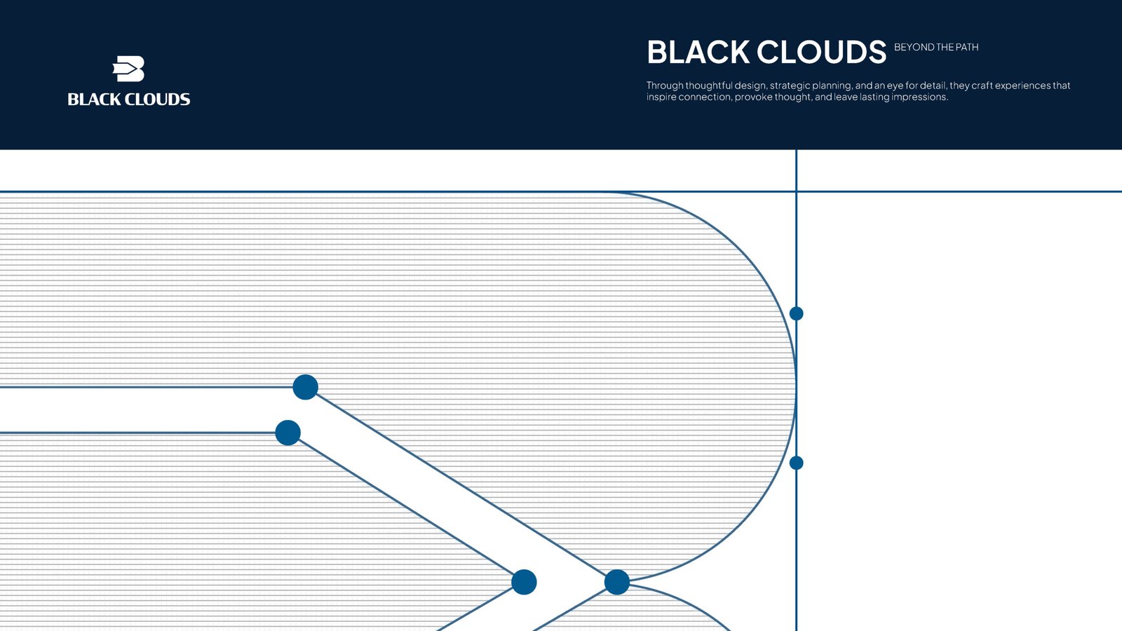
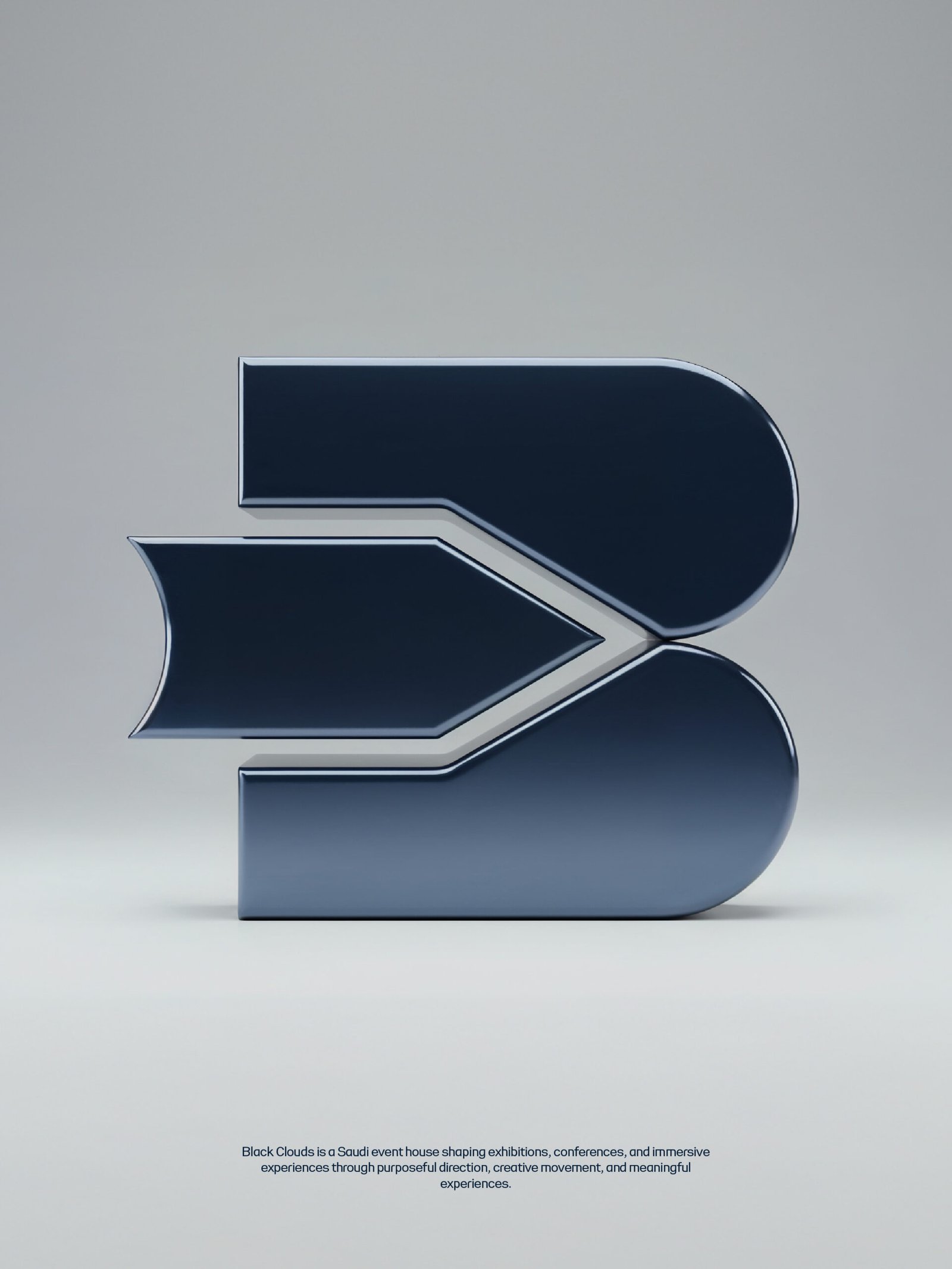
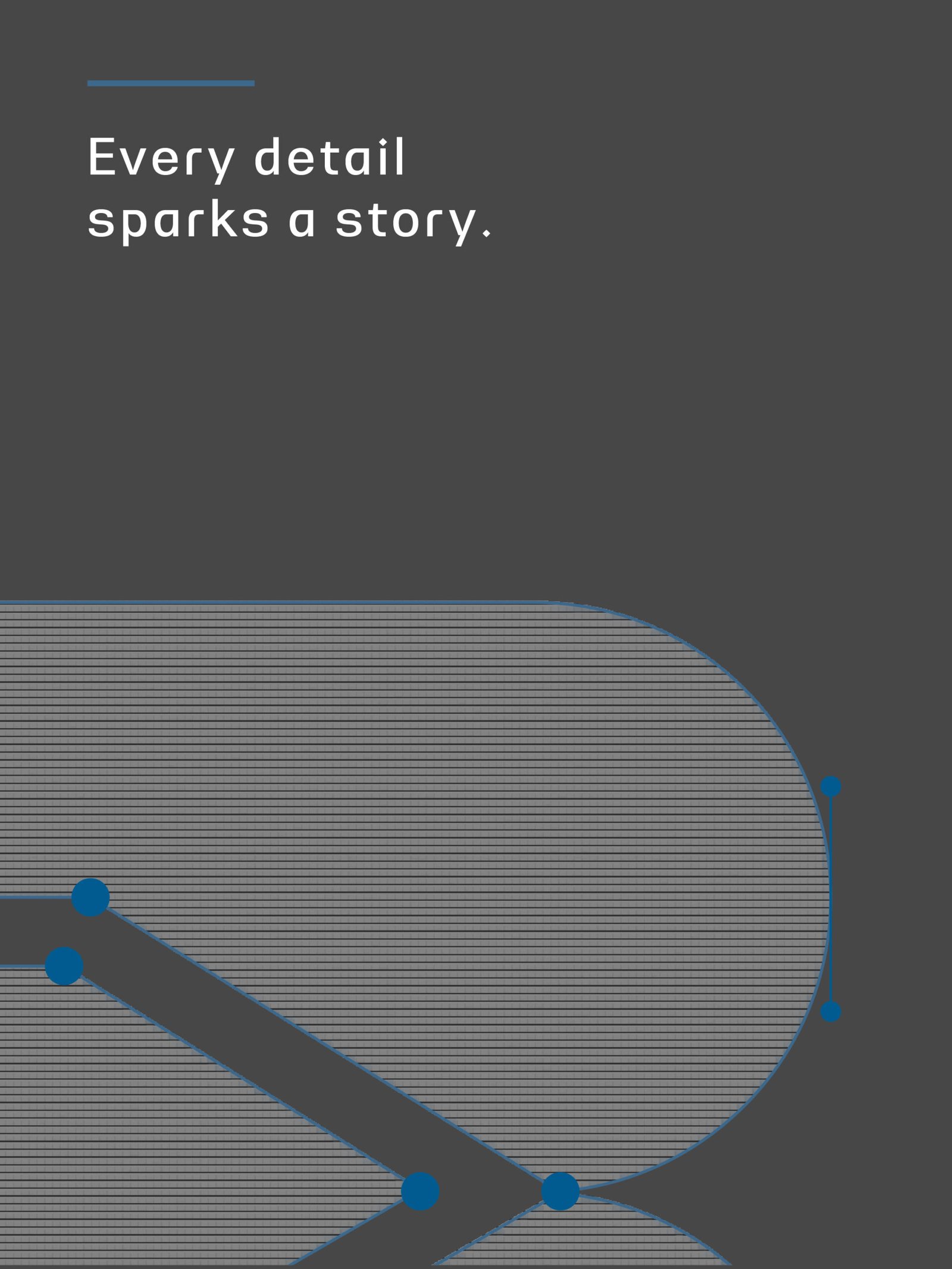
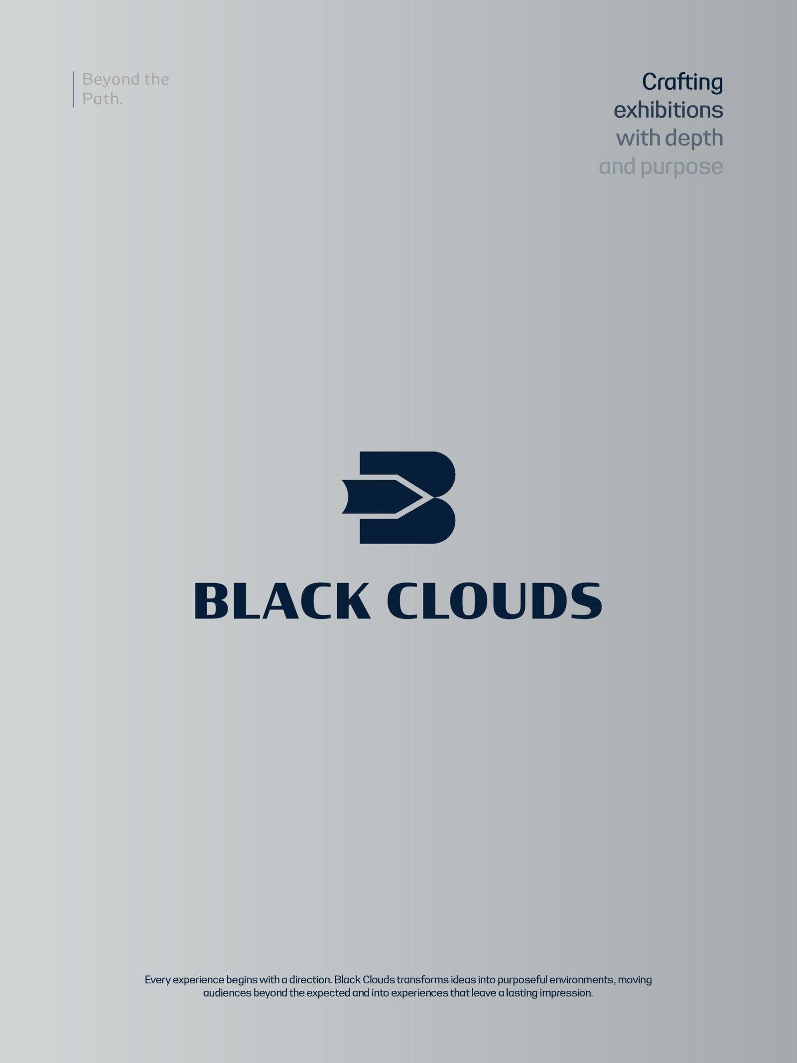
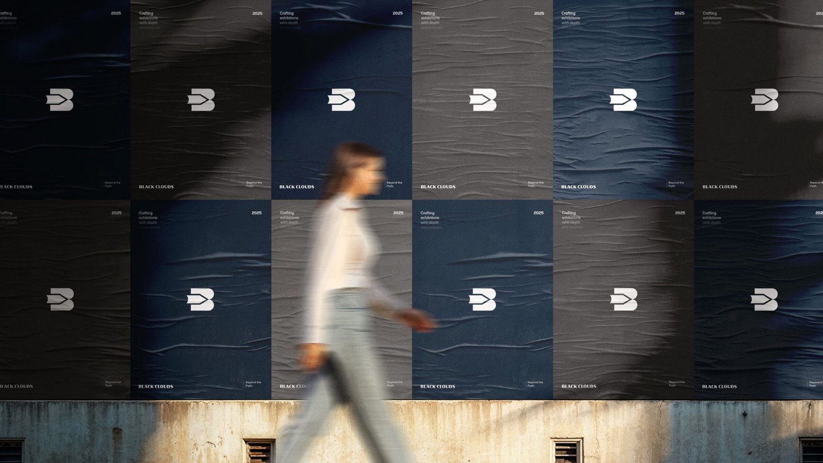
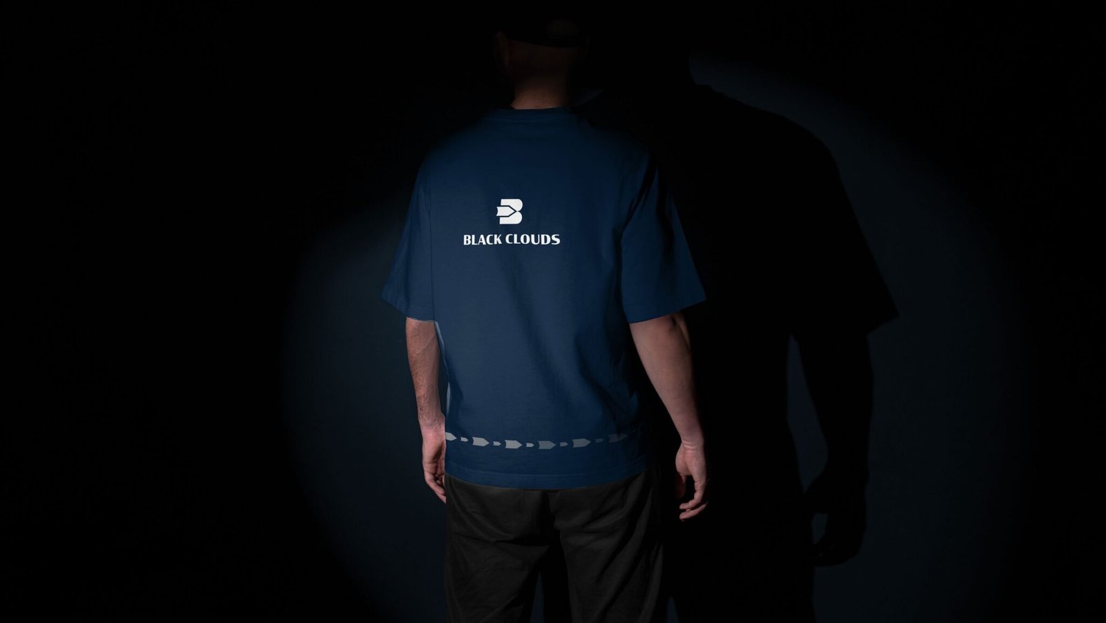
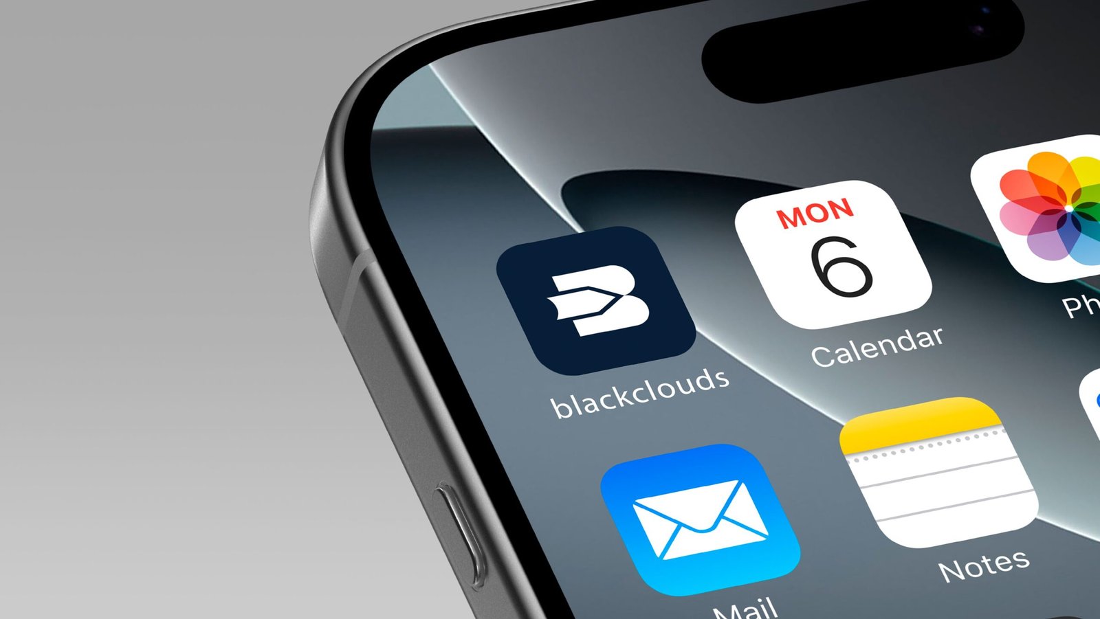
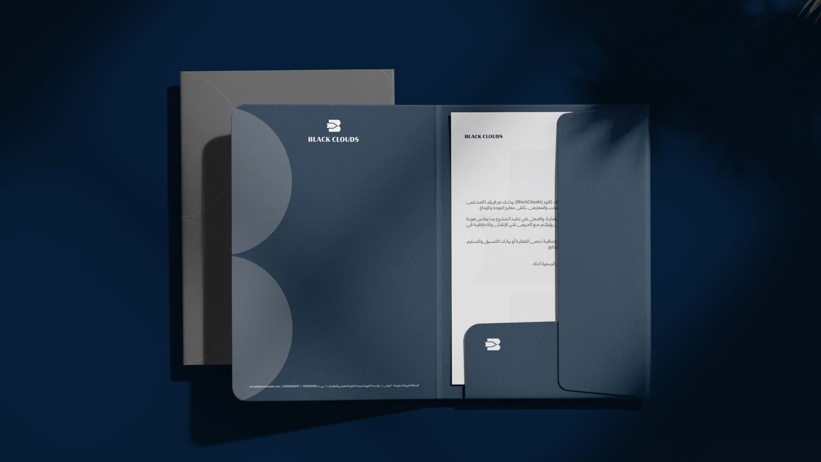
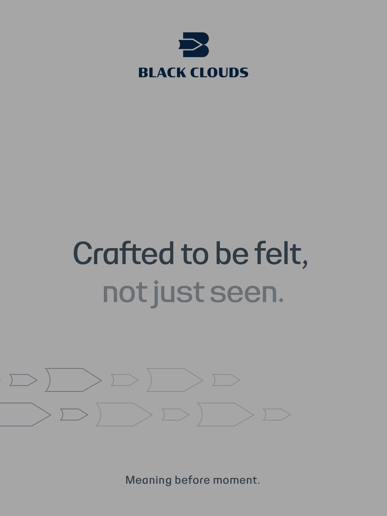
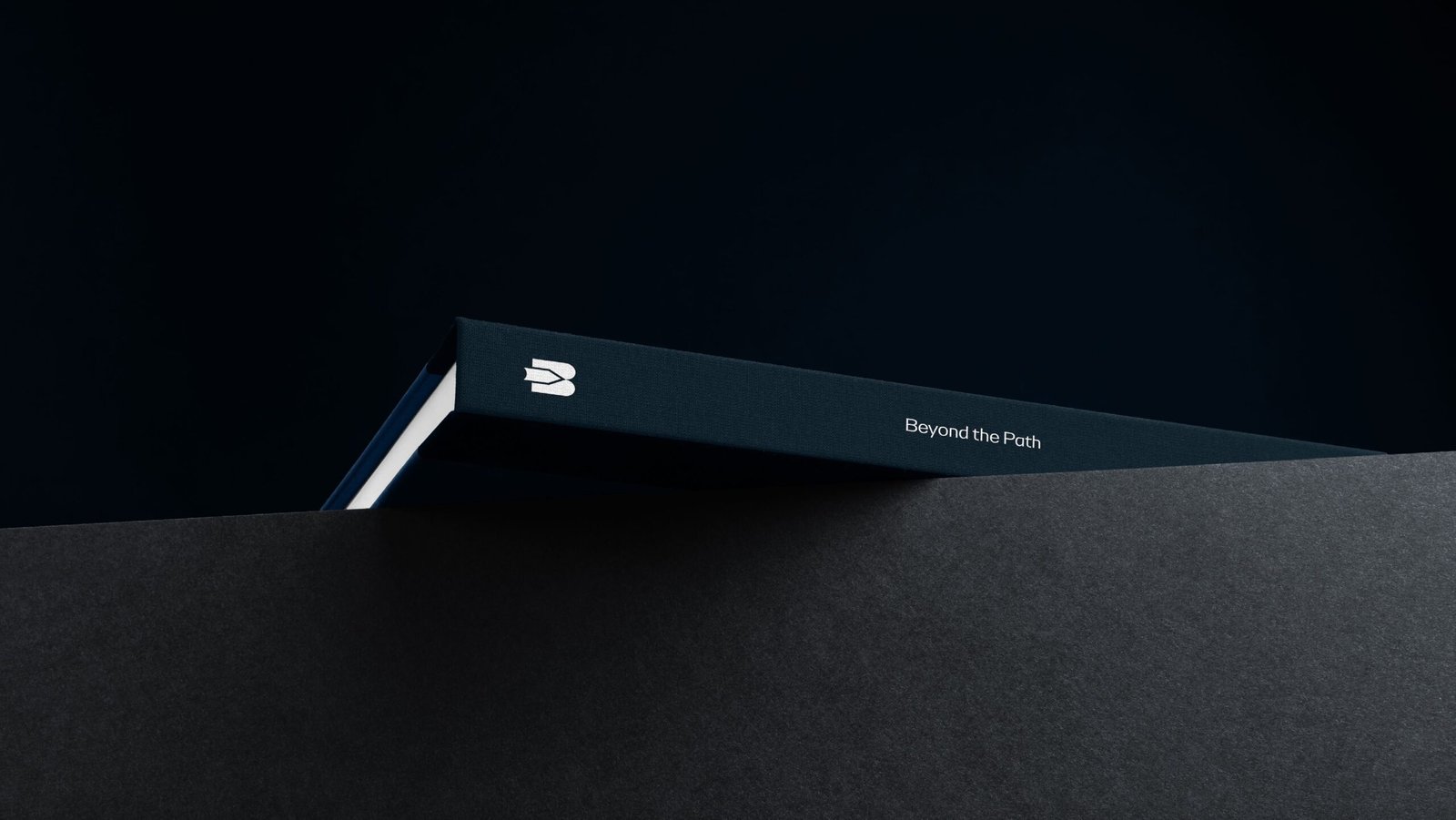
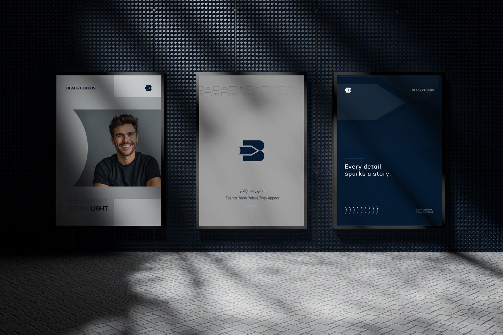
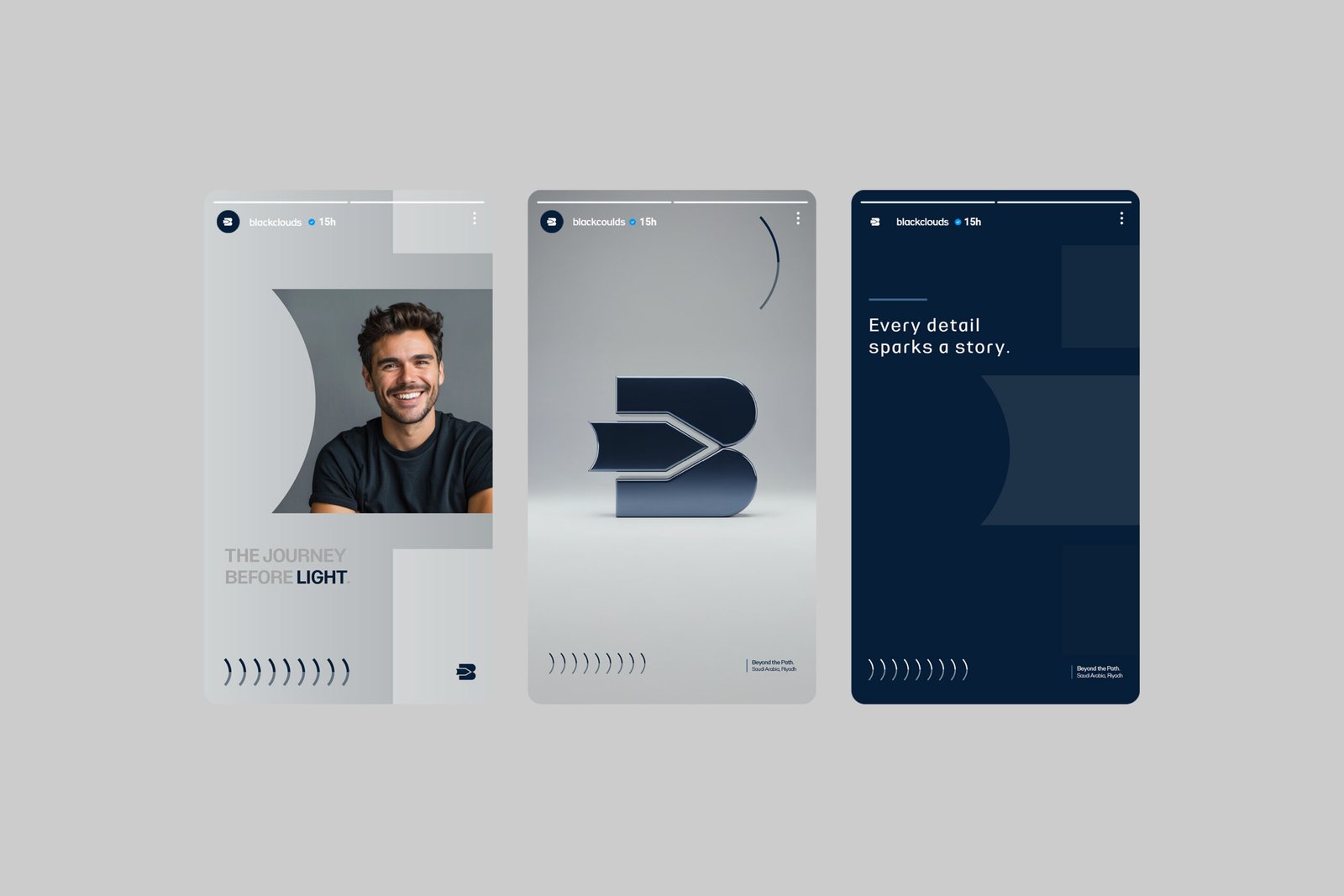
At the heart of the identity is a custom-designed “B” monogram seamlessly integrated with a forward-pointing arrow.
The letterform establishes an immediate connection to Black Clouds, while the arrow introduces the central idea of direction and forward movement.
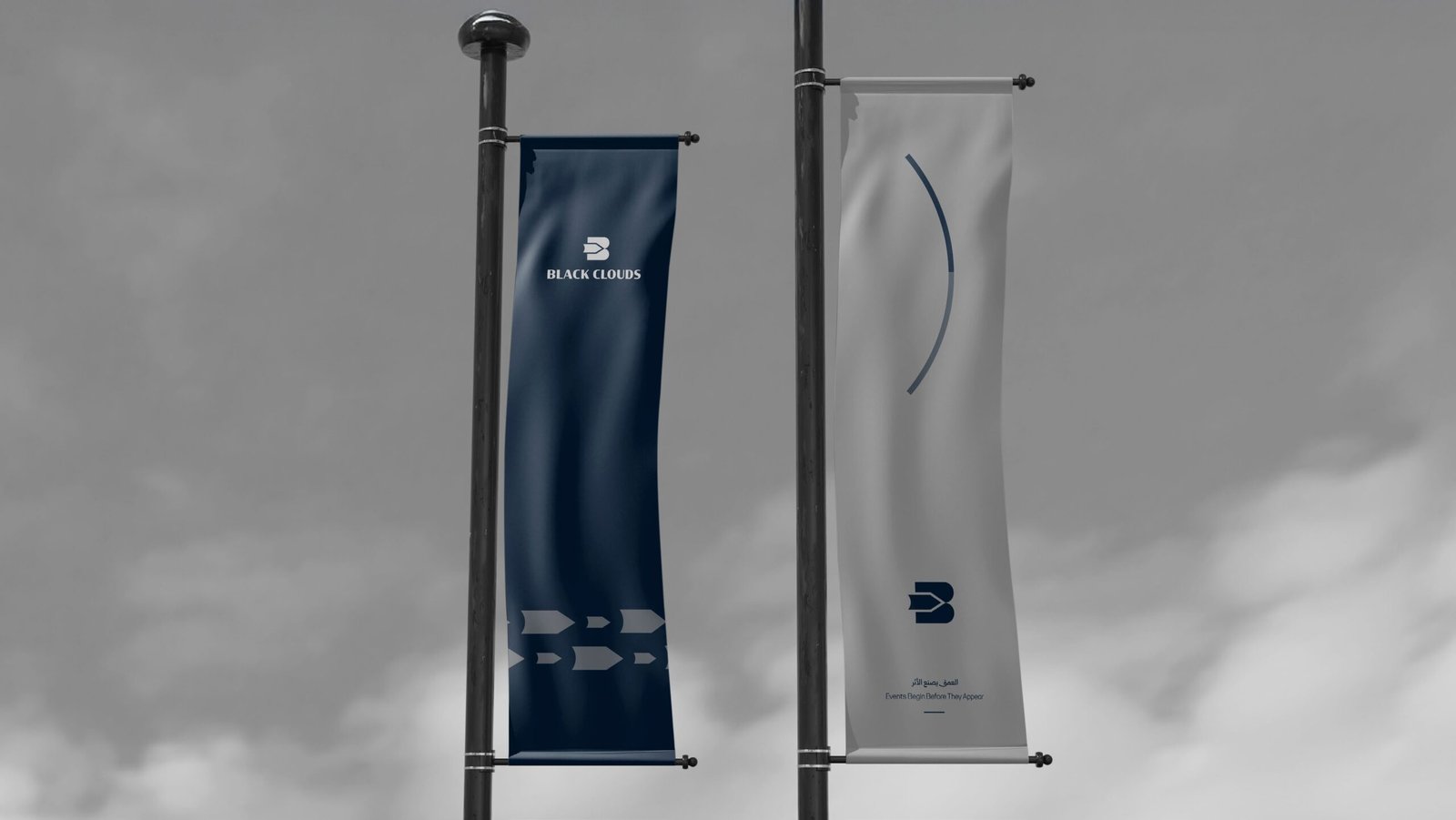
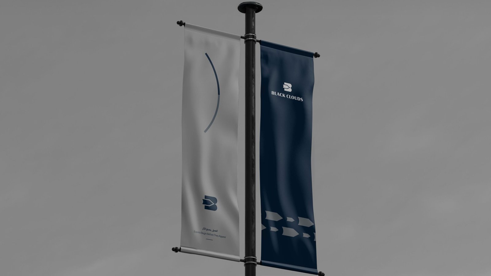
Rather than functioning as a decorative symbol, the mark became the foundation of the entire identity system representing momentum, progress, ambition, and continuous movement.
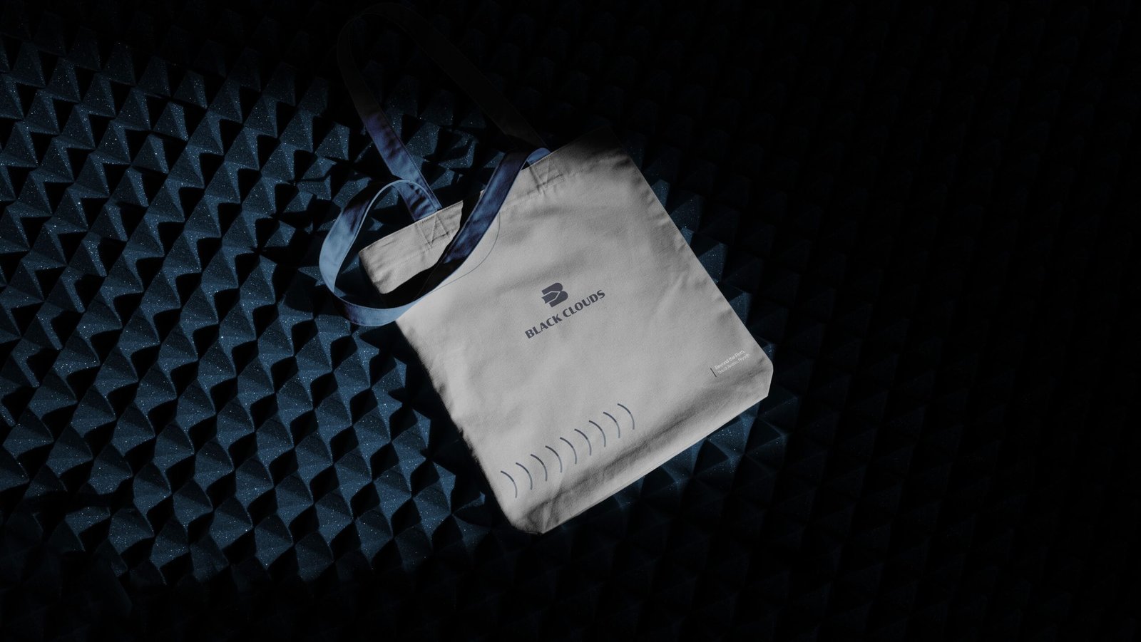
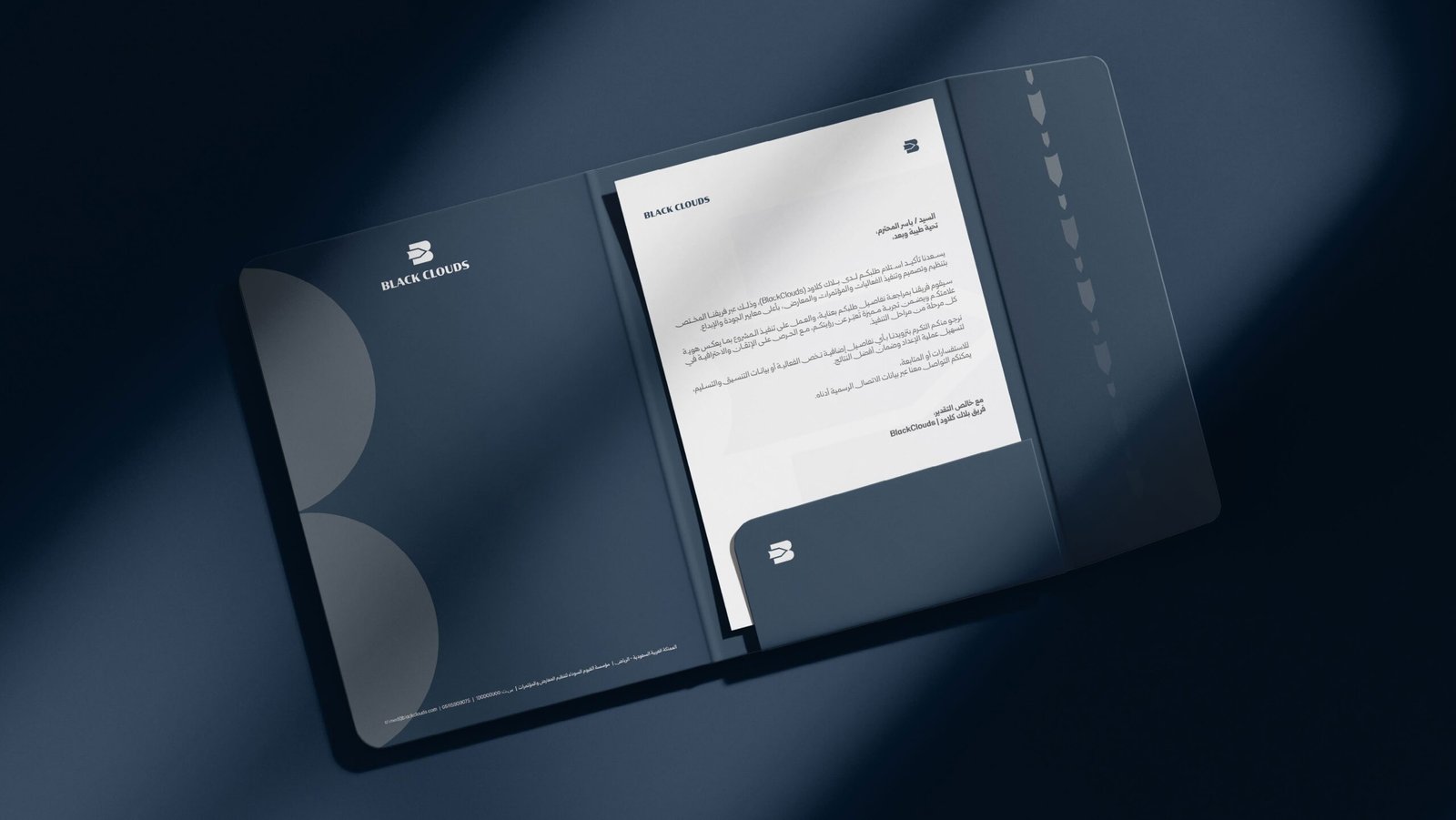
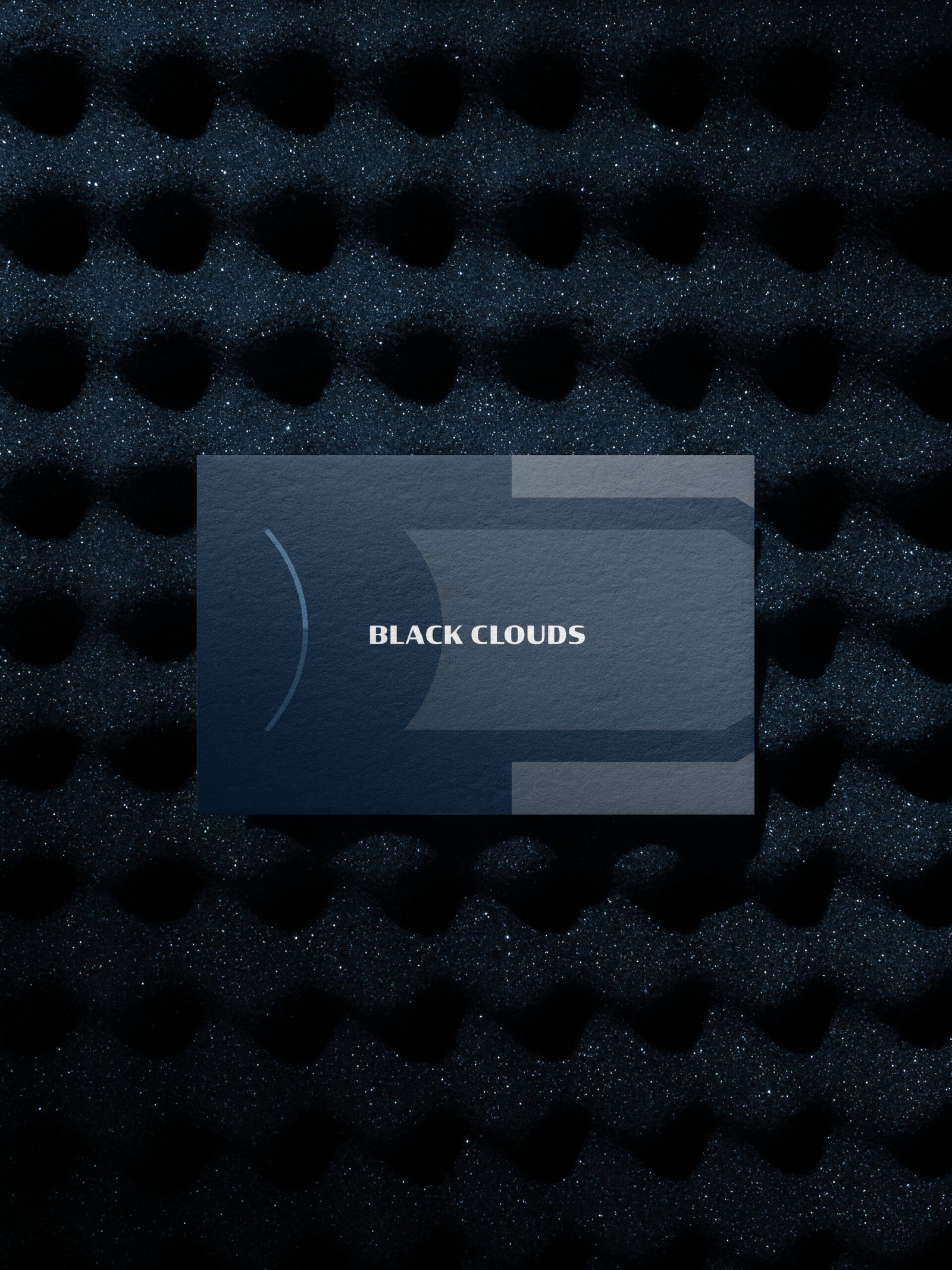
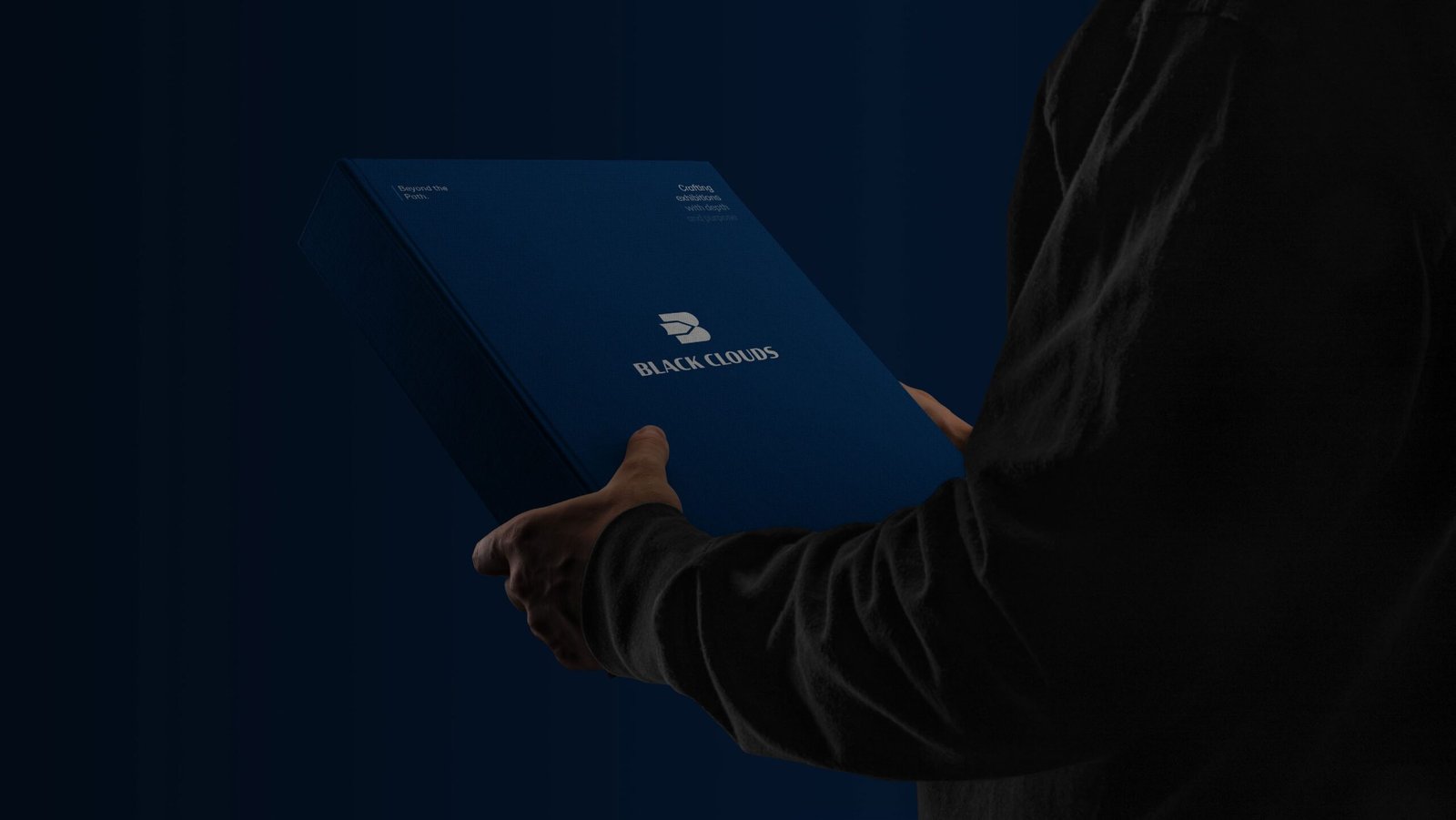
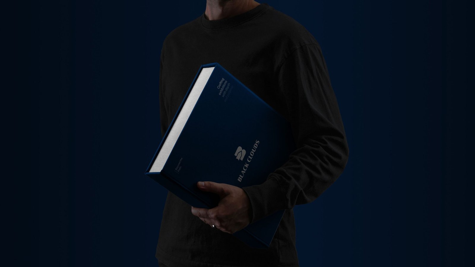
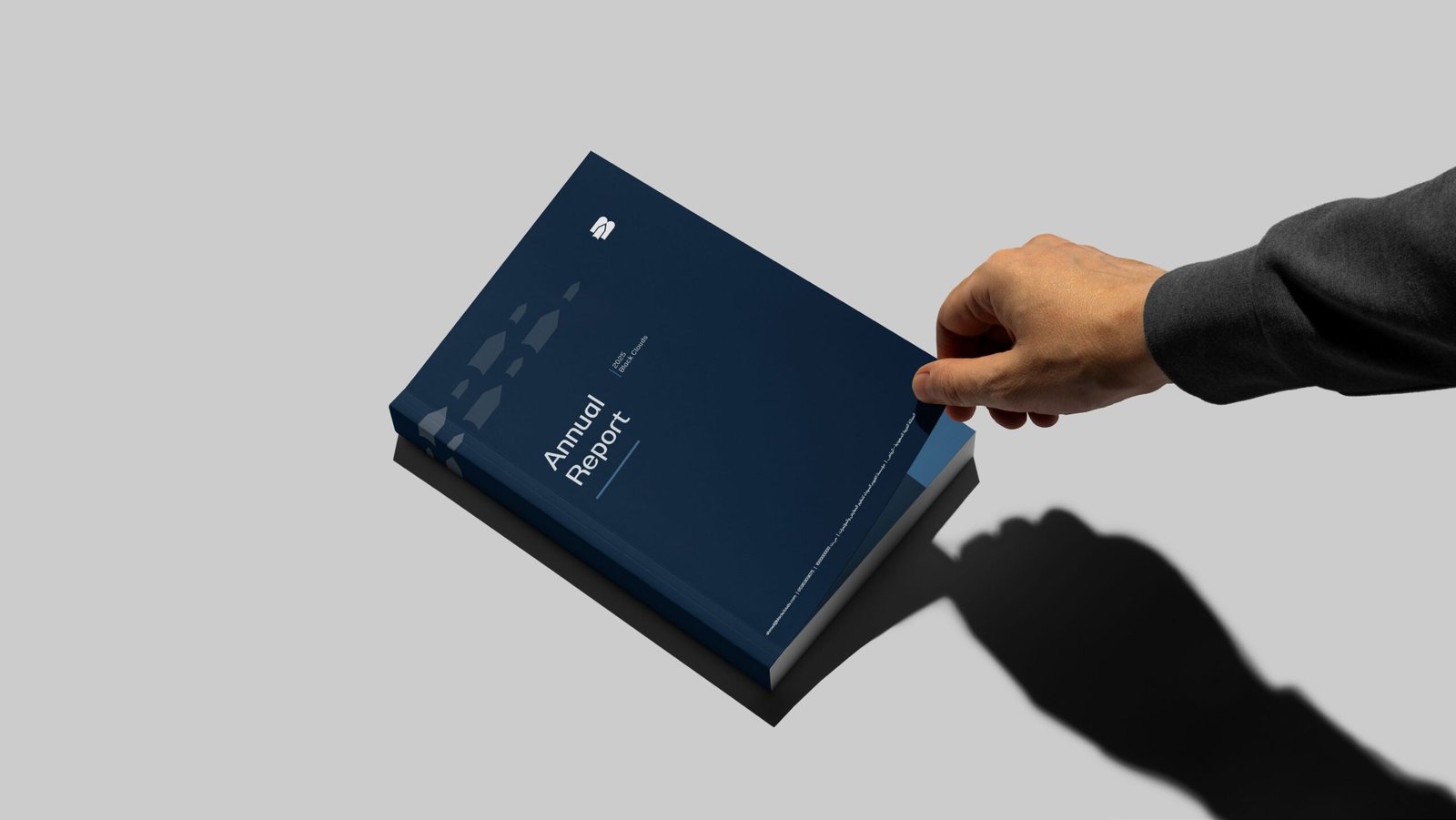
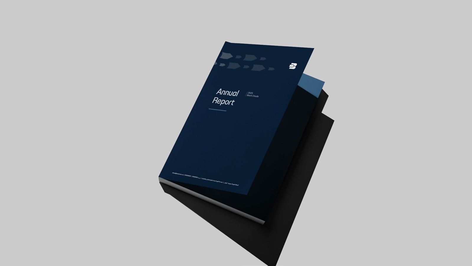
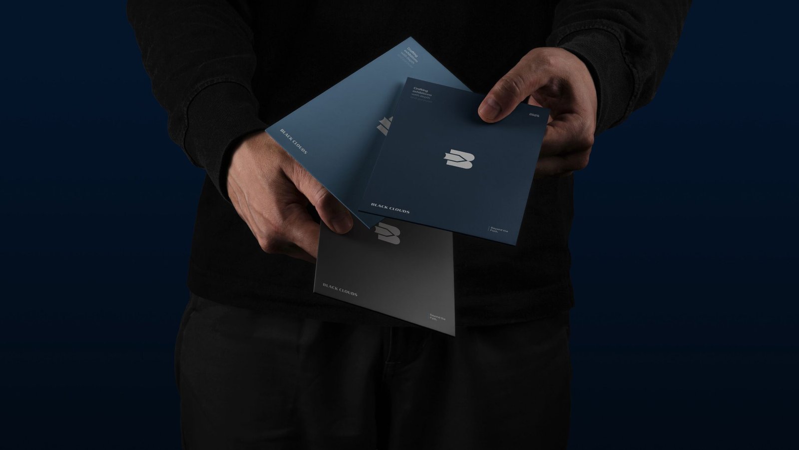
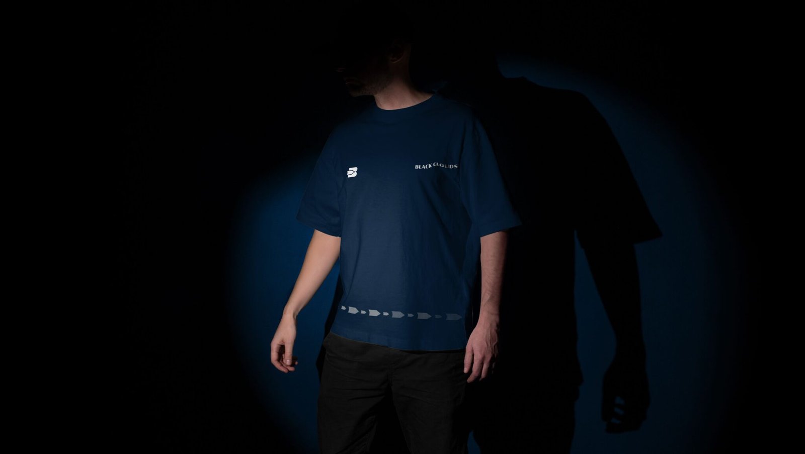
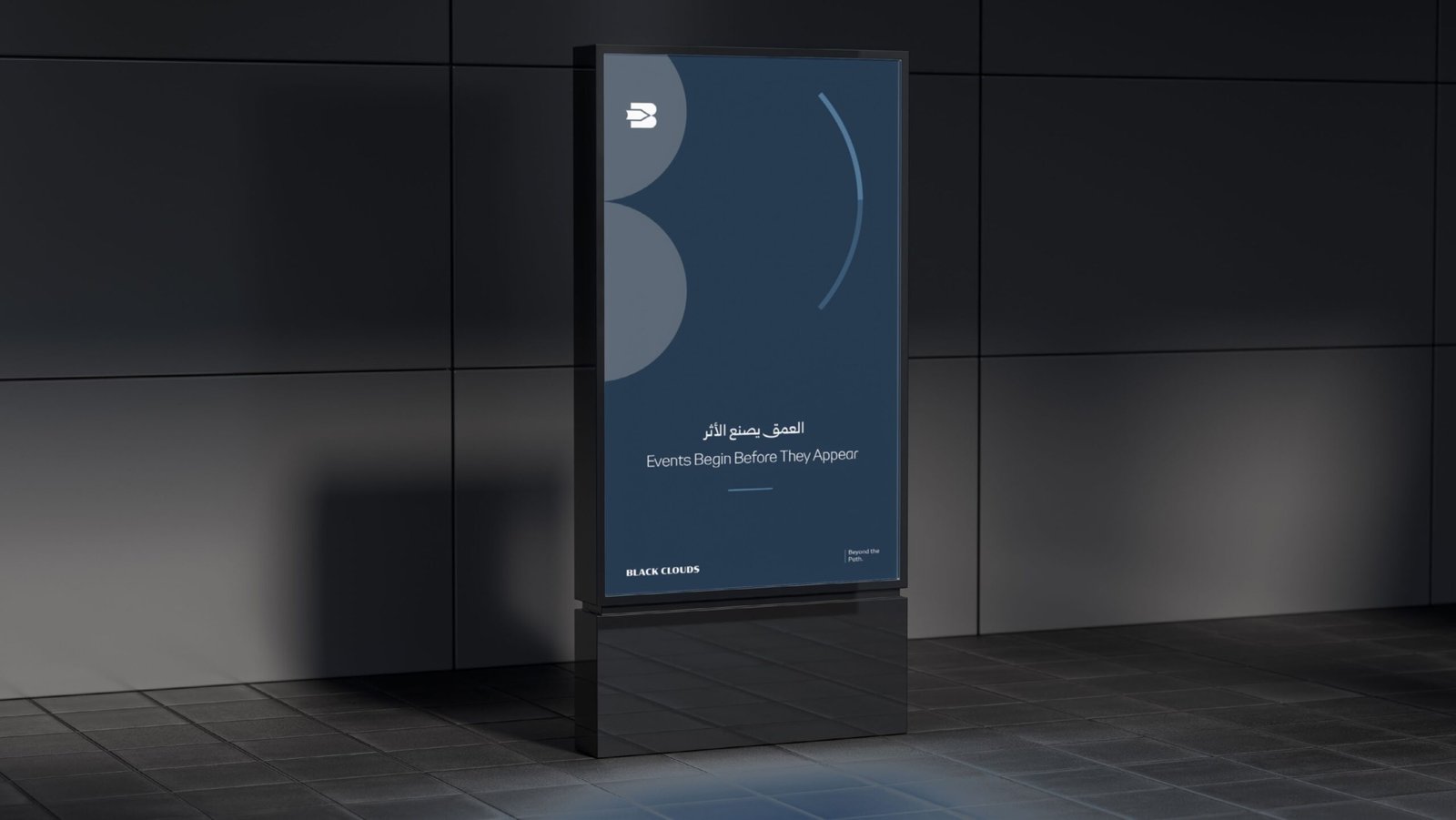
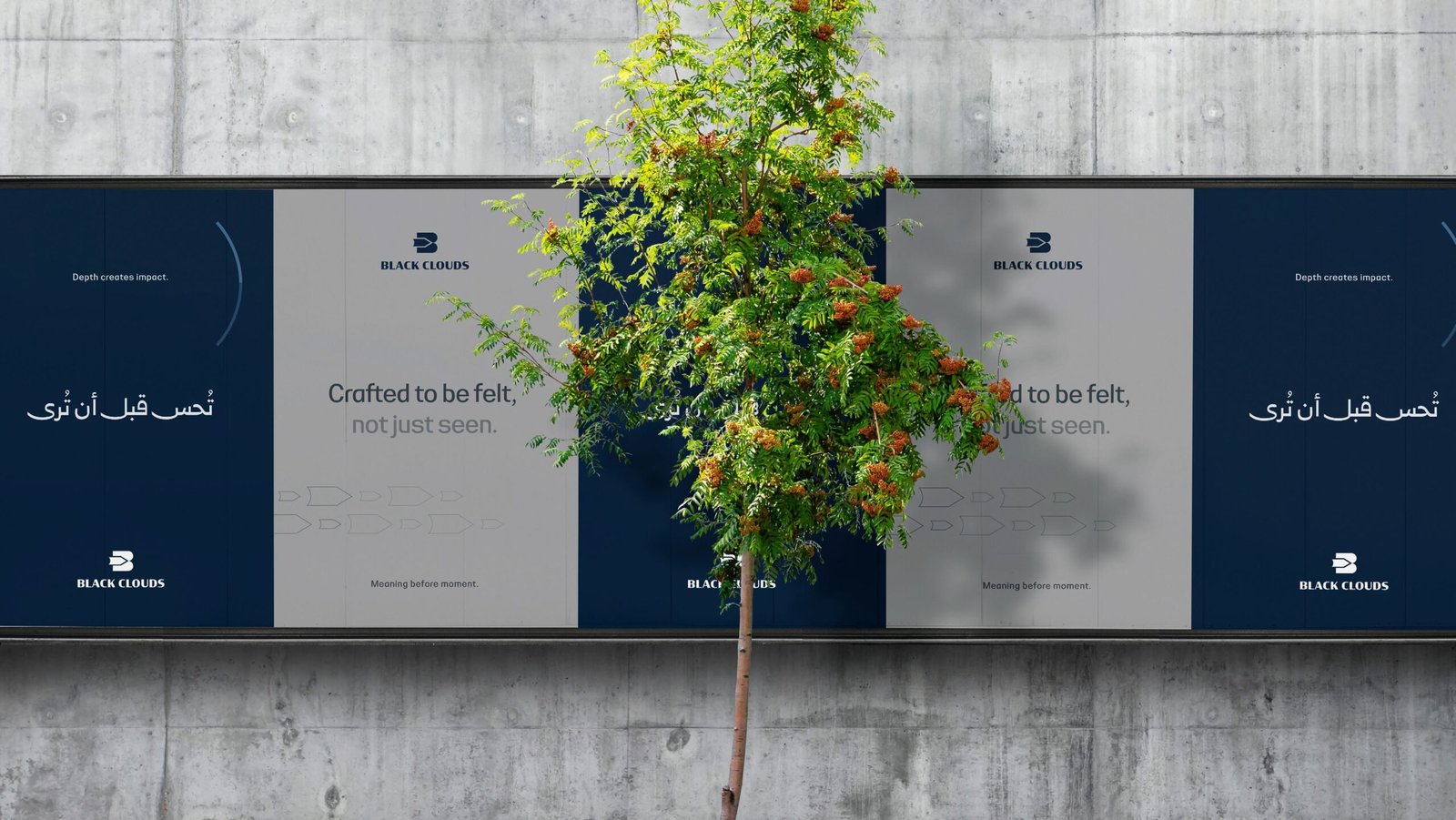
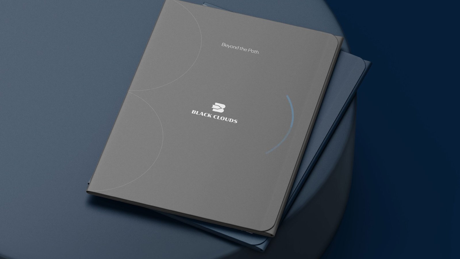
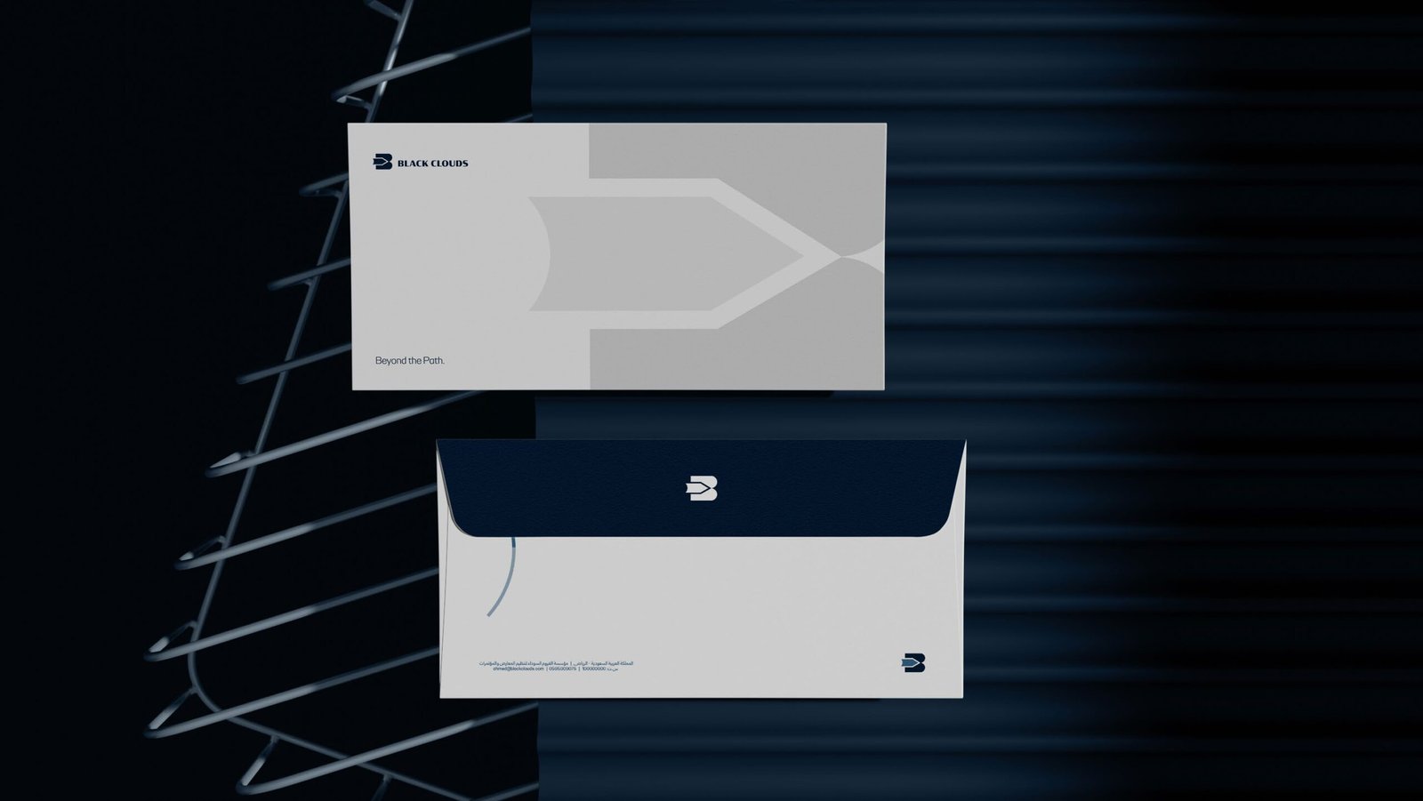
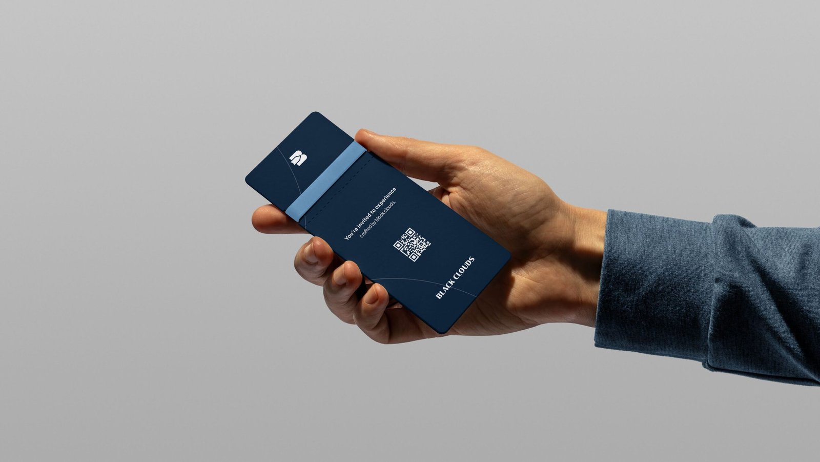
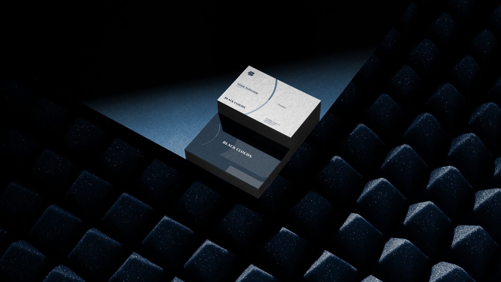
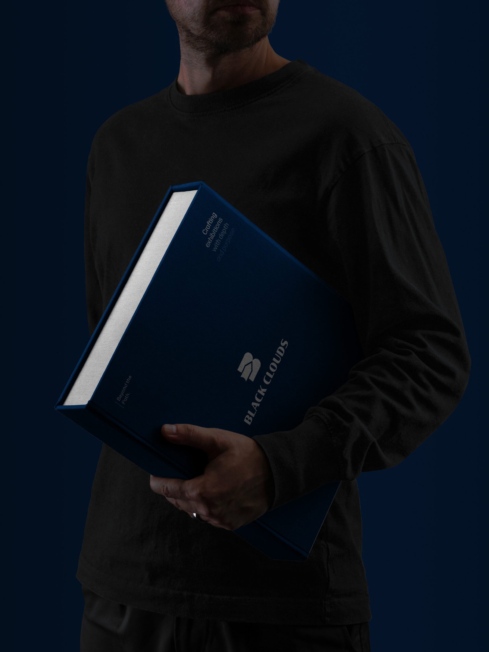
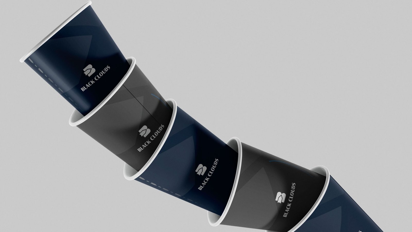
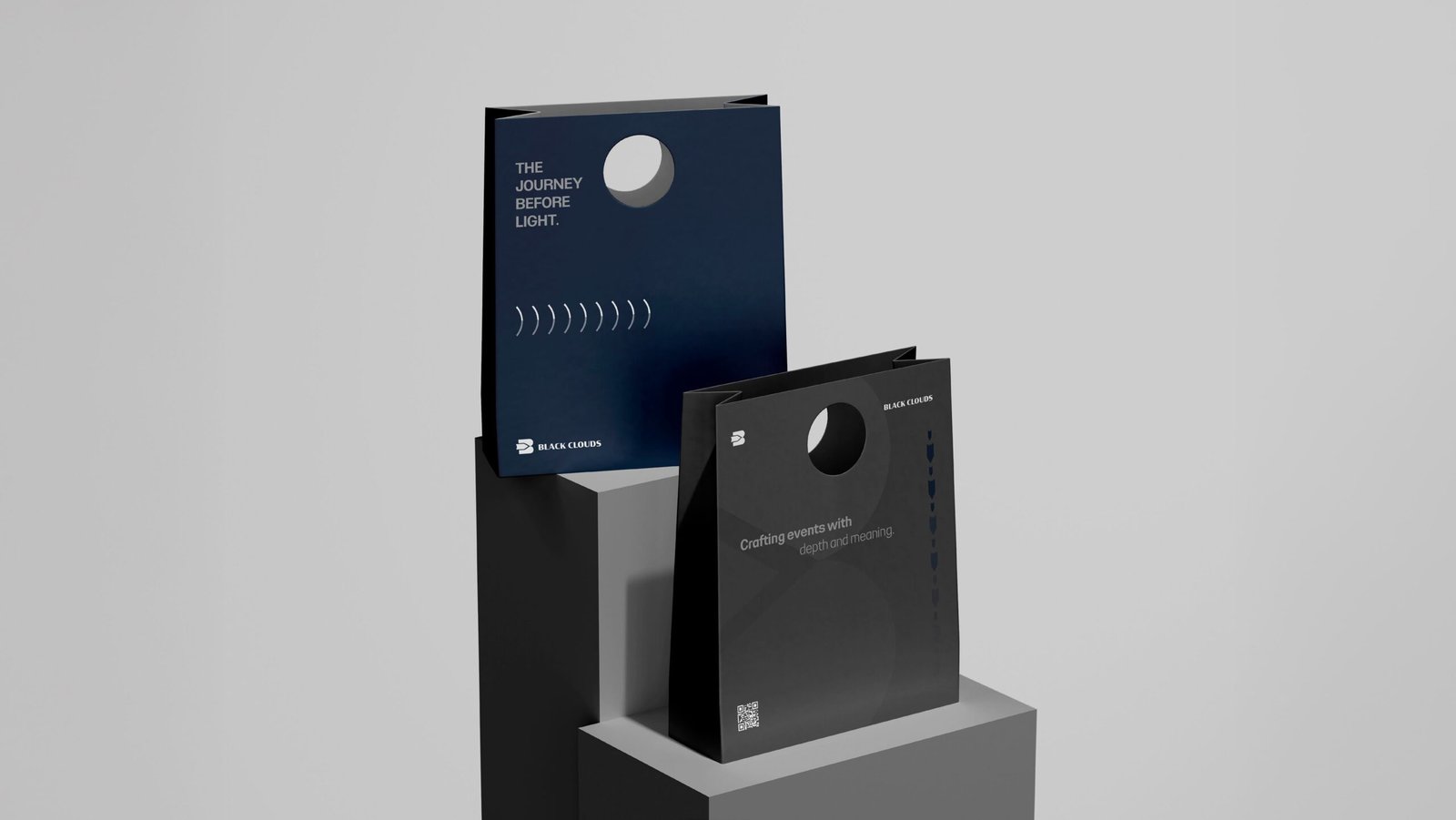
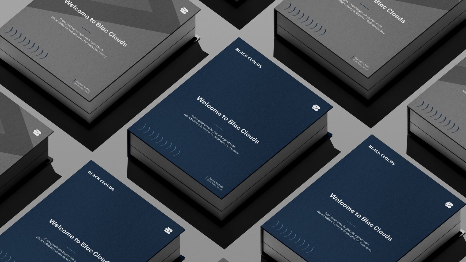
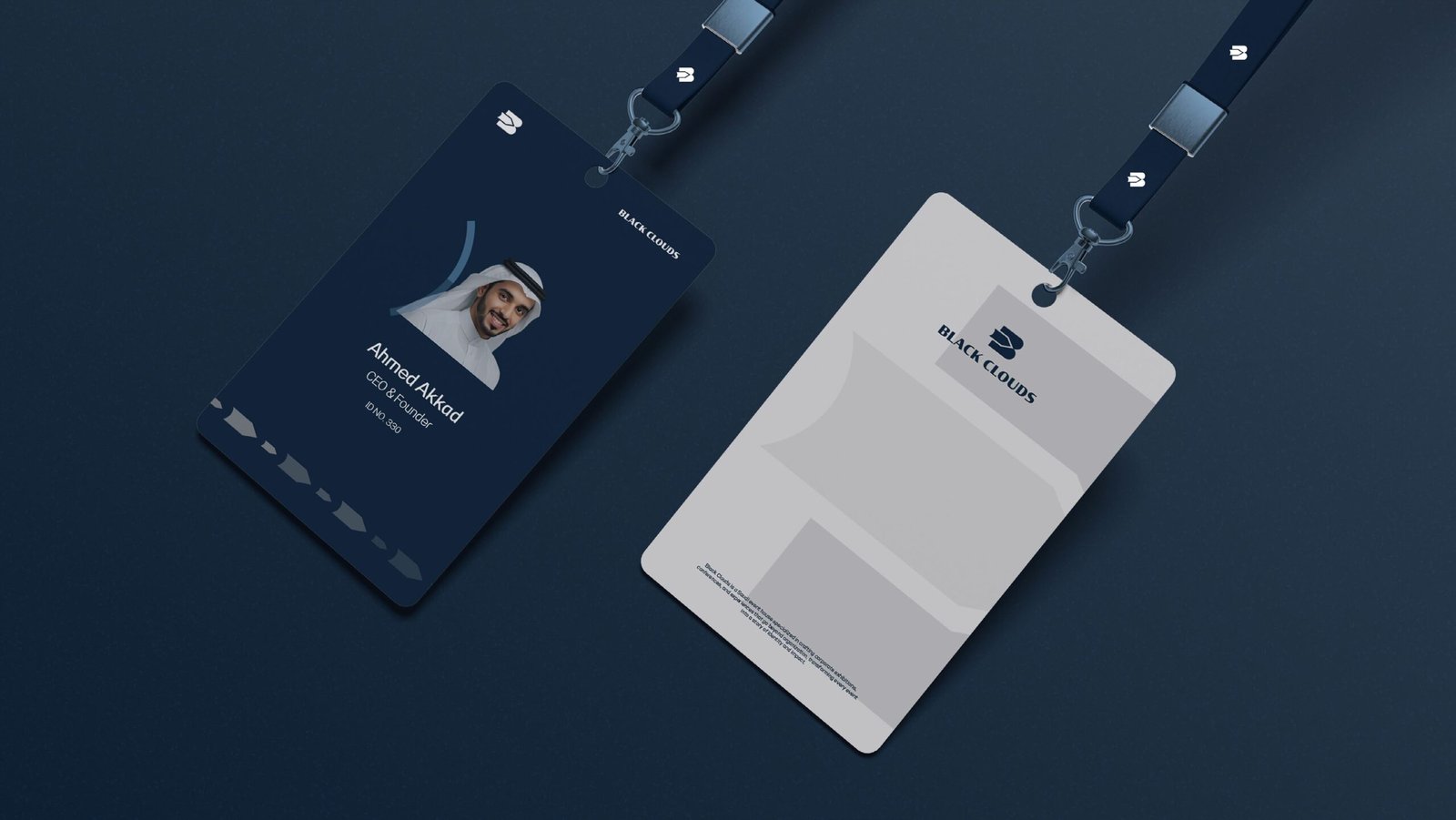
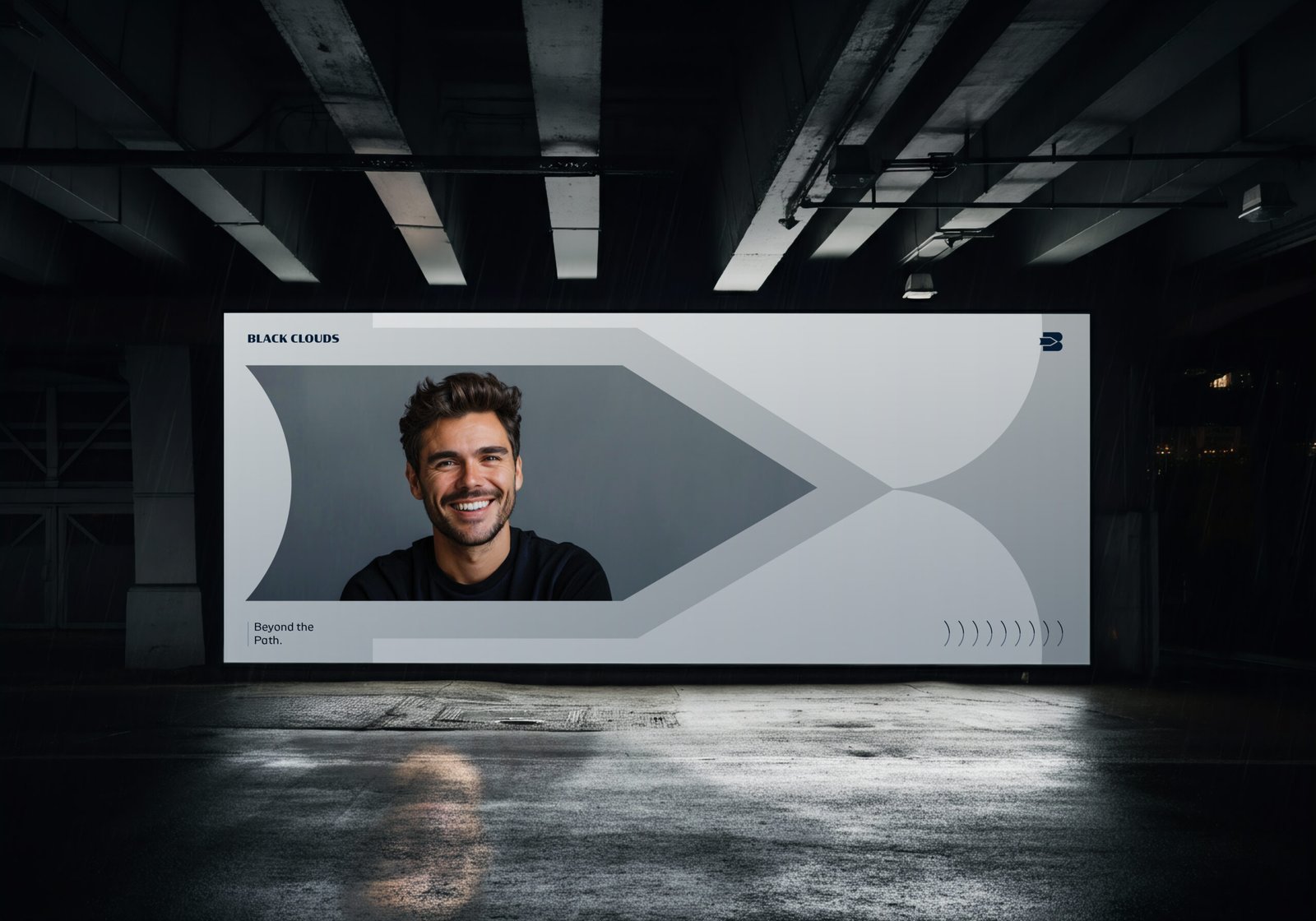
The arrow geometry was then developed into a flexible visual language, extending across environmental graphics, exhibition spaces, event credentials, signage, printed materials, digital platforms, apparel, packaging, and large-scale spatial applications.
This allowed the identity to move beyond static branding and become part of the experience itself.
From the first visual encounter to the physical environment, every touchpoint follows the same principle:
Direction. Movement. Experience.
Guided by the tagline “Beyond the Path,” Black Clouds presents a brand that is designed not simply to follow a path, but to create what comes next.
Shaping Identities, Elevating Brands.
At FOURP® Agency, we believe meaningful identities are built where purpose meets creativity.
For Black Clouds, this meant transforming a simple idea of movement into a complete visual and experiential system one capable of guiding audiences through spaces, experiences, and moments with a clear sense of direction.